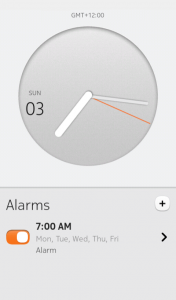
I want to talk about the Nokia N9 alarm clock application because it’s a really nice example of thoughtful, functional design – and because it’s only on the N9, so a lot of people won’t have seen it. There are more important things in life than getting excited about an alarm clock app, but its nice when simple things are done well.
I don’t know how many of these ideas are borrowed from previous apps (the N9 is contemporary with the iPhone 4S), but either way it’s implemented exceptionally well.
The main screen is informational. The full information on each alarm you have set is shown, and each can be turned on or off with the slider instead of having to touch on the entry to edit it. The plus adds a new alarm, and the Alarms section can scroll if there are more than two.
I don’t think I’ve seen another alarm where you can set the time you want in two touches or less. In case it wasn’t intuitive enough, the clock dial here mirrors the size of the analogue clock on the previous screen. Just in case you still don’t get it, the alarm time is shown above the dial. But everyone gets it, because it’s simple.
Touching and dragging on the minute marker moves it to the nearest minute, but touching directly at a spot on the circle moves it to the nearest five minutes. So you can change your alarm from 7:00 to 7:30 with a single touch without accidentally setting 7:31. If you actually want 7:31, just drag it around.
The AM/PM selection was also intuitive for me but may not be for everyone – did you guess that you need to drag the hour circle around? You can also do it in a couple of touches.
When you drag, the phone plays a quiet click sound and vibrates slightly as you rotate, as if you’re clicking a timer around. When you touch, it animates quickly but smoothly to the new position. There’s so much attention to detail here.
The More options screen has the options you’d expect, and shows the current settings.
The Repeat selection is nice. Select as many or as few as you want. There’s no such thing as an invalid selection: Rather than “Never” and “Every day” being settings themselves, which would cause conflict with the individual day settings, they’re more like indicators which also serve as group-deselect and group-select actions.
Touching on “Every day” doesn’t cancel the others, it selects all the day entries automatically, as well as the “Every day” entry itself. Deselecting a day will also deselect “Every day”. “Never” is automatically selected when everything is deselected, and “Every day” is automatically selected if you select each day individually.
Once you’ve set an alarm, a popup tells you how much time is left until it goes off. I was surprised that it even predicts daylight savings changes for your location, adding or removing an hour as necessary. I always thought that the time was just adjusted by the phone company when it switched, but somehow it knows. If you try to set a time that won’t exist because of a daylight savings switch, it knows that too.
When the alarm goes off, it stops automatically when you pick up the phone, not when you choose Stop or Sleep. And of course, you can turn the phone off at night and it still turns itself on in the morning for the alarm.
It is missing one feature that I miss from Symbian: There’s no option to keep the phone on after you stop the alarm. So if the phone was off, it’ll go back off, and then you have to turn it on again.
I also appreciate the look they’ve gone for with Meego (the N9’s OS) in general. It’s near the flat design aesthetic that was just becoming popular at the time, but with more shadows and gradients to give everything some depth.
It’s unfortunate that simple applications are often worked on just enough to be functional. Sometimes we get more features that aren’t needed rather than polish to existing ones. Can we get more stuff like this instead?


