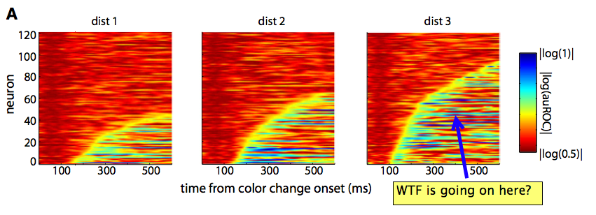
If you want to take a step toward joining the in-crowd of chromatically-sensitive data viz geeks, your best bet is to start by bashing jet. Even if you don’t know it by name, I can guarantee that if you’ve read many scientific papers, you’ve seen jet before. For example, here’s a snapshot of a plot from neuroscience journal which is skewered by an appropriately ranty blogpost on the subject:

Jet is the default colorbar originally used by matlab, and this default was inherited in the early days of Python’s matplotlib package. The reasons not to use jet are numerous, and you can find good arguments against it across the web. For some more subdued and nuanced arguments, I’d start with the paper Rainbow Color Map (Still) Considered Harmful and, for more general visualization tips, Ten Simple Rules for Better Figures.
So what do I have to add to this discussion that hasn’t been already said? Well, nothing really, except the code snippet I shared above. Let me show you what it does.
