When Samsung announced the Space Monitor, I knew in an instant that it was going to be something I had to try out in person. Now that I’ve had time to do so, I’m happy to say it’s much as advertised, a streamlined and solid monitor with a smart new design — but not necessarily one for everybody.
Samsung Space Monitor
Pros:
- Clever space-saving design
- Quiet, attractive look
- Solid color out of the box
Cons:
- Doesn’t rotate and height depends on distance from wall
- Sub-par viewing angles
- Doesn’t work with every desk
Price: $400 (27-inch); $500 (32-inch)
We don’t review a lot of monitors at TechCrunch — none, really. This was more of a curiosity to me. I’m interested in design and monitors are usually ugly at best. But I was impressed with Samsung’s approach here and wanted to see if it worked in real life.
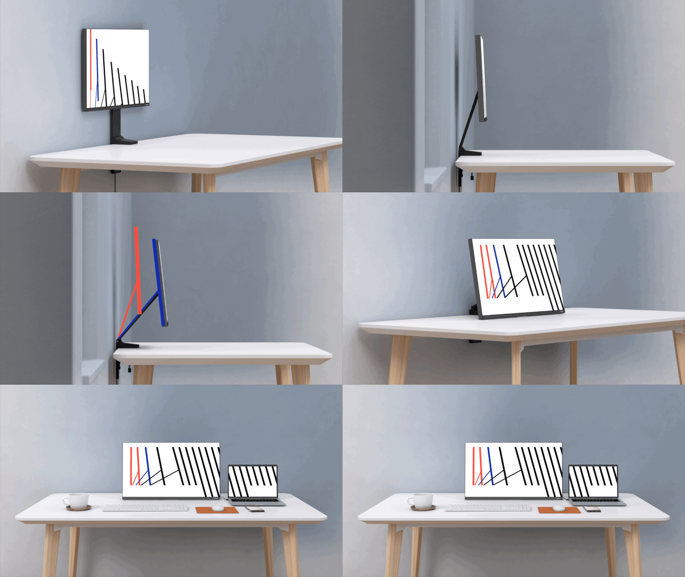
The big advance of the Space Monitor is its very low-profile mount, which grips the edge of your desk on the wall side and can be folded up flat against it. It can rotate up and down, the monitor tilting to taste — not so far as the Surface Studio but with that same general range of motion.

The monitor itself comes in two varieties: a larger 32-inch 4K one and a smaller 27-inch one at 2560×1440. I reviewed the smaller one, as the large one has a lower refresh rate and I really don’t have any use for 4K in my workflow.
The ideal situation for this thing is a relatively small work space where having the monitor actually sitting on your desk kind of invalidates all the space around it. With the Space Monitor, the stand is flush with the wall, clearing up the area below and in front of it even when it’s folded outwards. It’s easier than piercing the wall for a free-floating display
The performance of the monitor, as far as I am able to tell, is good but not great. The colors are vibrant and the default settings are solid, if perhaps a little warm (easily adjusted, of course). The refresh rate goes up to 144 Hz, which is more than enough for gaming, and can easily be tweaked to 120 for those of us who are very picky about video pulldown and other deep frame rate stuff.
One thing that isn’t impressive is the viewing angle. I feel like the sweet spot for this monitor is far narrower than on the Dell Ultrasharp IPS panel I’ve used for years. If you’re not sitting directly in front of it, you’re going to get color and brightness falloff at the edge you’re farthest from.
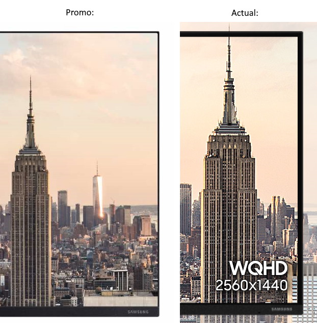
 The bezel is narrow, a bit more than a quarter inch, a little thicker on the bottom side. It’s also nearly flush on the top and sides so you don’t feel like the bezels protrude towards you. All in all it’s a very handsome and understated design, as these things go. It’s worth noting that Samsung appears to have fudged the press imagery a bit and the microscopic bezel you see in official images is not actually what you get.
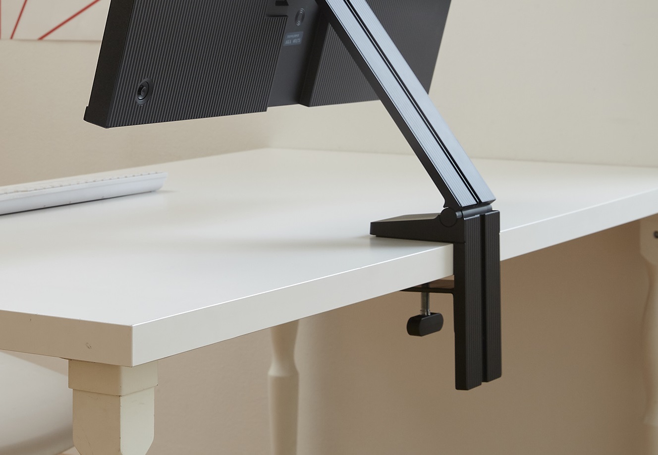
Installation isn’t quite as easy as just setting something down on your desk, but if you have a compatible desk, it’s literally as easy as sliding the clamp on and tightening it. A custom cable (optional, but convenient) combines HDMI and power into one, and fits into a groove on the back of the stand, eliminating clutter.
But you’ll want to take a good look at your desk to make sure it is compatible. I didn’t, and had to jury-rig a solution.
Basically, unless your desk is more or less solid and has a ledge that the clamp can close down on, you might have a problem. My desk is solid and about an inch and a half thick, but has a sort of wall that juts down about two more inches. I removed and reattached the bottom part of the clamp so it could just barely be slipped around the wall, but then the screw wouldn’t reach the bottom surface of the desk, so I had to fill the gap with a book. (It’s okay, I’ve got lots.)

The stand is plenty stiff and the monitor stays exactly where you’ve put it, but it is a little wobbly — understandable given that it sits at the very tip of a 14-inch-long arm. I only really noticed when I was typing very hard or bumped the desk, when I noticed it wobbled more and longer than the Dell on its traditional stand.
Now, if you’ve looked closely at the way this monitor and stand is set up, you may have noticed something else: this thing can’t rotate. Yes, unfortunately, the nature of the Space Monitor means that it must always be parallel to the desk edge it’s attached to, and can only move directly perpendicular to it. There is also no way to slide the monitor up and down, or rather to do so you must also move it towards or away from you.
For some this is unacceptable. And although it’s fine for me as a primary monitor, it would never work as a secondary one, like the Dell I now have angled toward me adjacent to the Samsung.
That does significantly limit its use cases, and the spaces in which it works well. But I still feel it’s a great option for some. If you have limited space and plan to primarily work from the sweet spot directly in front of it, this is a solid monitor big enough for productivity, movies, and games.
For those seeking a low-profile, space-saving alternative to the usual monitors, the Space Monitor is a great option. But for multiple-monitor setups or people who shift the angle a lot, it probably isn’t the best. At $400 it has strong competition from the usual suspects, but for some people the slight increase in image quality or the ability to slide the monitor up and down isn’t worth losing the desk space or having a clunky design. The Space Monitor is available now, at Samsung’s site or your usual electronics retailer.
