Michael Leggett is even more annoyed with Gmail than you are.
“It’s like Lucky Charms got spewed all over the screen,” he says to me, as he scrolls through his inbox. It’s true. Folders, contacts, Google apps like Docs and Drive–and at least half a dozen notifications–all clutter Gmail at any given moment. And of course, there’s that massive Gmail logo that sits in the upper left-hand corner of the screen. Just in case you forgot that you just typed “gmail.com” into your browser bar three seconds ago. “Go look at any desktop app and tell me how many have a huge fucking logo in the top left,” rants Leggett. “C’mon. It’s pure ego, pure bullshit. Drop the logo. Give me a break.”
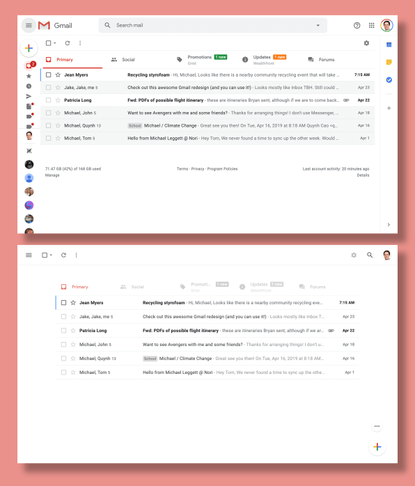
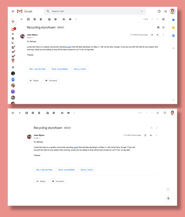
Rather than sit there and stew, Leggett decided to do something about it: He created a free Chrome extension called Simplify, where all the extraneous folders and functions overloading Gmail seem to melt away, leaving you with a calm screen and nothing but your messages. It’s understatedly beautiful, and every button just seems like it’s in the right place. In fact, it feels a little too good for some random free Chrome extension made by some random developer. Let’s just say that Leggett was highly qualified for the job.

You see, Leggett was actually the lead designer for Gmail from 2008 to 2012. He also cofounded the since-discontinued Inbox, which attempted to reimagine Gmail for the modern era. After leaving Google in 2015, he did a short stint at Facebook working on Messenger, before landing at Nori, a company addressing climate change with blockchain where he still works. Still, in his off hours, Gmail’s design continues to haunt him. He’s long known that the platform is something of a necessary evil for most of us. “It’s a survival mechanism,” he says to me. “You look at bad UI all day long and probably get used to tuning it out.”
Leggett has been trying to fix Gmail for over a decade. He remembers developing a massively complex Gmail concept back in 2008, that wrapped many of Google’s services into Gmail itself, with things like your Docs and chat filling tiny windows in a single browser screen. “We gave that to Larry and Sergey, and they were like, ‘This looks awful,’” Leggett recounts. “We walked out of the meeting and said, ‘They’re right. This is awful . . . that’s what led to Inbox.”
It would take six years and two redesigns to eventually launch Inbox, which became known as the better version of Gmail–with swipe gestures, smart categorizing your mail into purchases and finances, and an airier design scheme.
But even Inbox was a consolation for Leggett. “The original vision was much, much bigger than email,” says Leggett. “It was an app to replace every Google app but Search. It was a personal information app. It had a lot of different data sources–some even outside Google. It was like your inbox for the web, News, Calendar, and Docs.” Ultimately, management had decided that Google services should stay disparate. Leggett would grow frustrated by the frequent futility of working inside the big machine. “I jumped off in 2012, in part because I moved to Seattle, in part because I felt like it was dead man walking,” says Leggett. “The best I could hope for is, it’s really good and Google will force people to switch to Inbox, or it’s really good and they take the best features and put into Gmail.” The latter happened, to some extent. Gmail got tools like Smart Reply, Snooze (which allow you to silence an email until later), better gestures, and new emails that popped up in tiny windows, allowing you to multitask.
After leaving Google, and in his spare time, Leggett began developing a Chrome extension that would fix what frustrated him most about Gmail–first and foremost, what he sees as the app’s excessive visual noise. The extension was a personal project for himself and some acquaintances, and it wasn’t the first such extension he’s built. He’s developed over a dozen extensions that redesign sites around the web to his liking. “I’m not the world’s best designer by any means,” he admits. “But when something bothers me, I feel a need to do something about it.”
When Google announced the cancellation of Inbox, a good friend encouraged him to “just put your thing out there.” Mostly working alone, Leggett polished his extension into Simplify. Still, he sat on the project rather than going public. He wanted to give Google one last chance. Knowing that Gmail’s 15-year anniversary was April 1 and the company had teased some announcements, he thought that might include a revamp of Gmail’s design. Instead, the company announced the option to preschedule an email (“something we talked about for years and years,” he says). So he launched Simplify on April 2–the very next day.

After using it for about 15 minutes, I’ve already decided I’ll never go back. Simplify cuts down on the visual noise of Gmail’s right and left sidebars, eliminating them, and hiding them under pull-up and drop-down menus. It moves all of the core functions–like delete and archive–to the top bar. And there’s a lot of room on top to take advantage of, since Simplify gets rid of the prominent search bar in Gmail, and tucks it away to the right corner. And a small update that many people will appreciate is that the new mail button has been moved from the top left to the bottom right of the screen. It’s good there. Why? Because the new mail window appears at the bottom right of the screen, too. You can go from creating an email to typing an email faster. (That is, if you don’t use keyboard shortcuts to navigate around this UI entirely, which Leggett implores me to do.)
The extension has been downloaded over 15,000 times since launching this month. About 500 new people are installing it a day. Beyond that, Leggett can’t say much about Simplify’s success metrics. Given the extreme risk of allowing access of your email to a third-party service, he built Simplify to run entirely in your browser. It doesn’t serve ads or collect analytics of any sort. It has no way of making money. And he put the code onto Github to prove he’s being a good citizen.
Leggett already had an offer to buy Simplify. He’s promised that he will never sell it, though he has toyed with building a completely separate paid service some day (for which he has many ideas, and might extend his redesigns beyond Gmail). He readily shares dozens of additional fixes he hopes to make to Gmail soon.
“It’s been fun, really fun, making something, being able to serve something directly to people,” says Leggett. “To say, ‘I wish it did this,’ and then it does that, it’s fantastic. It’s so satisfying.”
